Ten App Store screenshots that read as one comic
For ComicFlow 3.6 I replaced ten separate App Store screenshots with one comic that runs across all of them, starring Kaede, a heroine with a paper katana. How she and her made-up library came together, and what it took to ship the set in 18 languages.
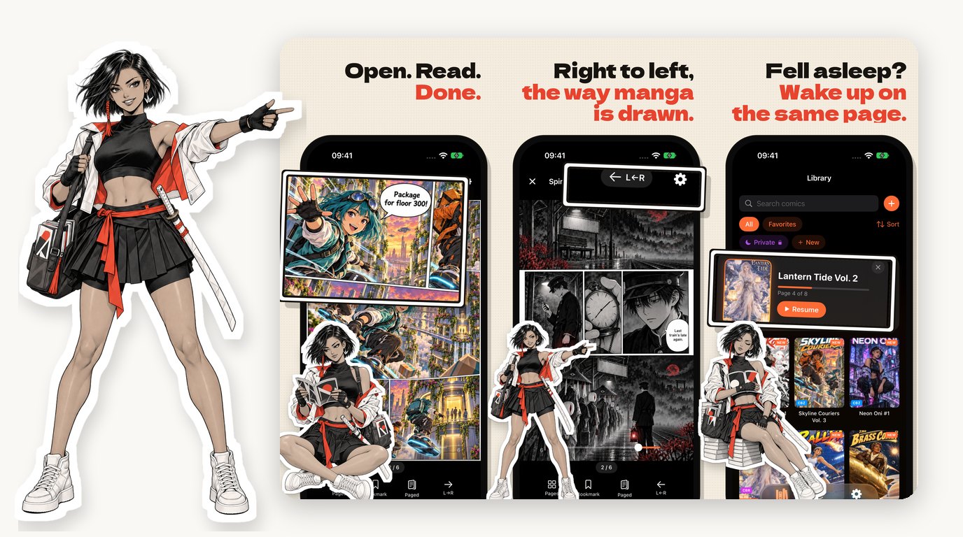
ComicFlow is a comic reader, and until this week its App Store screenshots looked like a settings menu. Ten dark frames, each with a shouted headline, a tag bar and a phone, each one standing on its own. They were accurate. They just didn’t look like anything a person who loves comics would stop scrolling for.
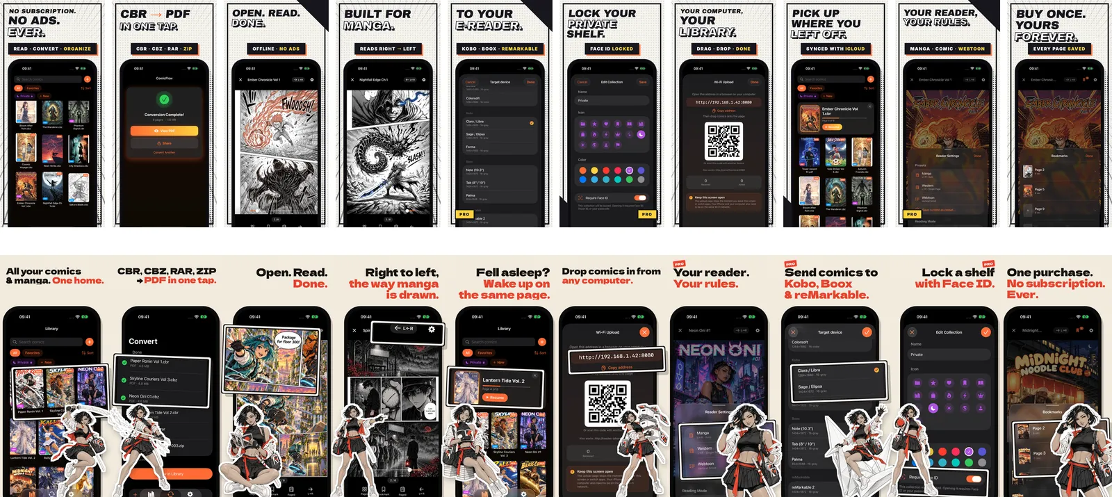
With 3.6, which went live on 12 October, the store page tells one story instead. The panels run across the joins between frames, so the row of screenshots reads left to right like a strip, and a girl with a paper katana walks you through the app as it goes. Her name is Kaede.
Why not just show real comics?
The honest way to show a comic reader is with comics in it. But I can’t put manga I don’t own the rights to on my store page, and a reader full of grey placeholder covers sells nothing. So the screenshots needed a library: covers, pages and titles that look like the real thing and belong to nobody else.
I wrote a brief for eighteen comics in the formats ComicFlow opens: CBR, CBZ, RAR, ZIP and PDF. A ramen stall under a railway bridge. A yōkai train station at night. A fox in a raincoat climbing to a lighthouse, in the clean-line style of a European children’s album. A retro rocket pilot, a badminton sports manga, a cyberpunk hacker, an art-deco detective. The cast is deliberately mixed in age, ethnicity and body type, because the people who read comics are.
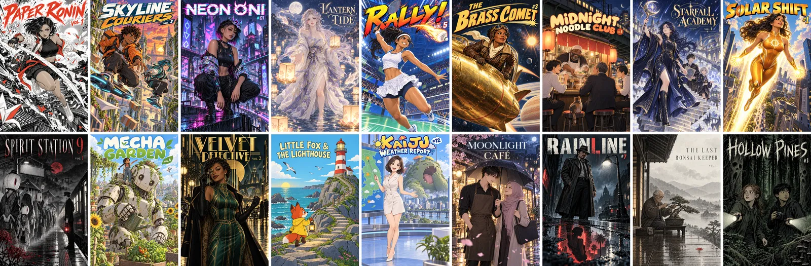
The art is AI-generated, made with OpenAI’s image model at its highest quality setting. I want to be plain about that, because a page full of convincing manga covers invites the question. I wrote the briefs, picked the results and threw away the misses. The rules in every prompt were the same: nothing that reads as an existing character, franchise, costume or logo; no publisher marks, barcodes or price boxes; and exactly the title I gave, spelled letter by letter. A cover with a misspelled title went straight back.
The whole set, cast and covers and inside pages, came to 58 images over one evening, for about $10 in API costs, counting the ones I threw away.
Kaede
One of those eighteen comics is Paper Ronin, and its heroine became the guide for the whole set. Kaede is Japanese-Brazilian, about 21, with a black bob and one long strand tied in a vermilion paper cord. She carries a satchel full of comics and a katana whose blade is folded white paper, with the creases still showing. The ink is black and white with one spot colour, a vermilion red that sits close to ComicFlow’s own orange.
A character only works across ten frames if she’s the same person in all of them, so she started as a model sheet: front, three-quarter and back, plus three faces. That sheet then went in as the reference image for every pose and every page she appears on.
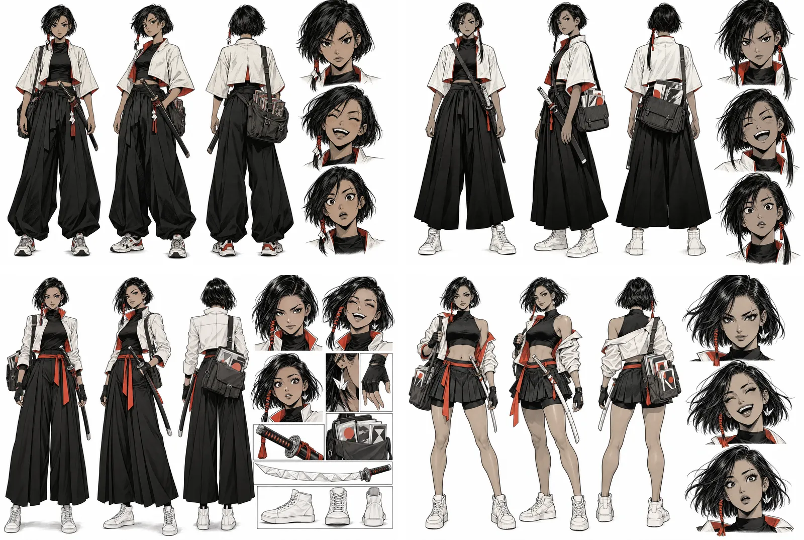
It took four sheets. The first followed my brief to the letter, wide hakama trousers and all. From there the outfit moved the most, towards something sportier that still reads as a modern samurai when she’s the size of a sticker.
Some details took more words than I expected. “A scar through her right eyebrow” can mean either side of the picture, so the prompt says “her RIGHT eyebrow (on the viewer’s left when she faces the viewer)”. And because every prompt describes the sheathed katana at her hip, a pose where she swings the sword can easily end up with two. The leap prompt spells it out: one katana, in her hands, and an empty sheath.
Every prompt for her also carries the same guardrails: she is an adult and clearly reads as one, the art is confident and cool and never sexual, and it suits a general audience. The App Store is a page anyone can open, and I’d rather say that in every prompt than hope for it.

Ten beats, one strip
Each frame is one feature and one beat of the story, and Kaede’s pose is the joke for that feature. She leaps past the library. She slashes through a list of files on the Convert screen. She sits down to read. She points at the right-to-left switch on a manga page. She falls asleep against a stack of manga, next to the card that brings you back to the same page. She staggers under a pile of comics for Wi-Fi Upload, rides a folded paper crane to an e-reader, holds out a seal stamp beside the shelf locked with Face ID, and winks on the last frame: one purchase, no subscription, ever.
The part I like most is the joins. A panel lifted out of one screen hangs over the edge into the next, and the strip only lines up if the frames are shown touching, the way the store shows them in a row.
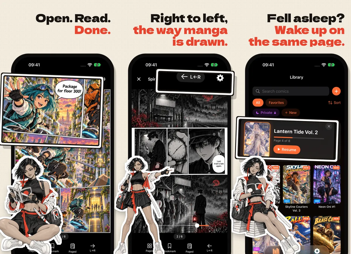
Everything inside the phones is real. The covers and pages are the made-up library, but the screens are ComicFlow itself, running in the simulator, not mock-ups. Frames seven to nine show Pro features, and they say so.
Real screens, eighteen times over
Getting real screens means getting the library into the app, in the same order, every time. A script erases the simulator and imports the eighteen comics through ComicFlow’s own Inbox, one launch per file, so the cover grid always comes out in the same order.
Then the app has to be put into the right state for each frame. The UI tests that do this normally find buttons by their label, and that breaks the moment the label is German or Thai. In 14 of the 18 languages the tests couldn’t find the controls they needed: the right-to-left toggle, the Sources row, the close button on the continue-reading card. So four small launch flags set those states directly for the screenshot run, and the tests stop guessing.
One flag found a real problem. The Wi-Fi Upload screen shows the device’s name, so for the screenshots it reads kaedes-iphone.local, or kaedes-ipad.local on iPad. My first version picked between the two with the device idiom. ComicFlow has a unit test that fails if the idiom appears anywhere in its sources, added after the iPhone Duo showed me the app assumed every iPhone was the same shape. It failed, as it should, and the name now comes from the device model.
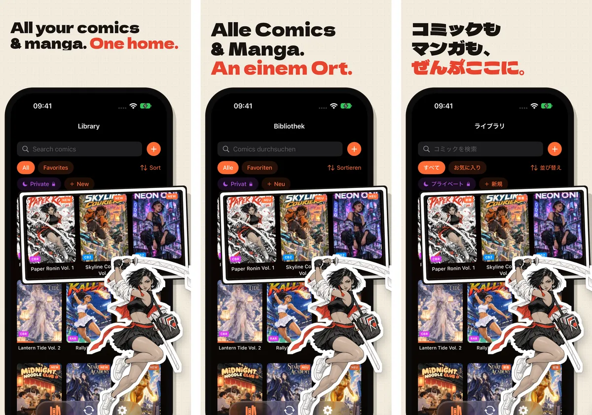
The frames themselves are plain HTML and CSS, rendered by headless Chrome at the exact pixel sizes the App Store wants. A check fails the export if any translated headline doesn’t fit its box. Another script finds where each lifted-out panel sits in the translated layout and moves the callout to match, because a German button is rarely where the English one was. Twice, a Chrome render froze at zero CPU and held up the whole run for an hour, so every render now times out after two minutes and tries again.
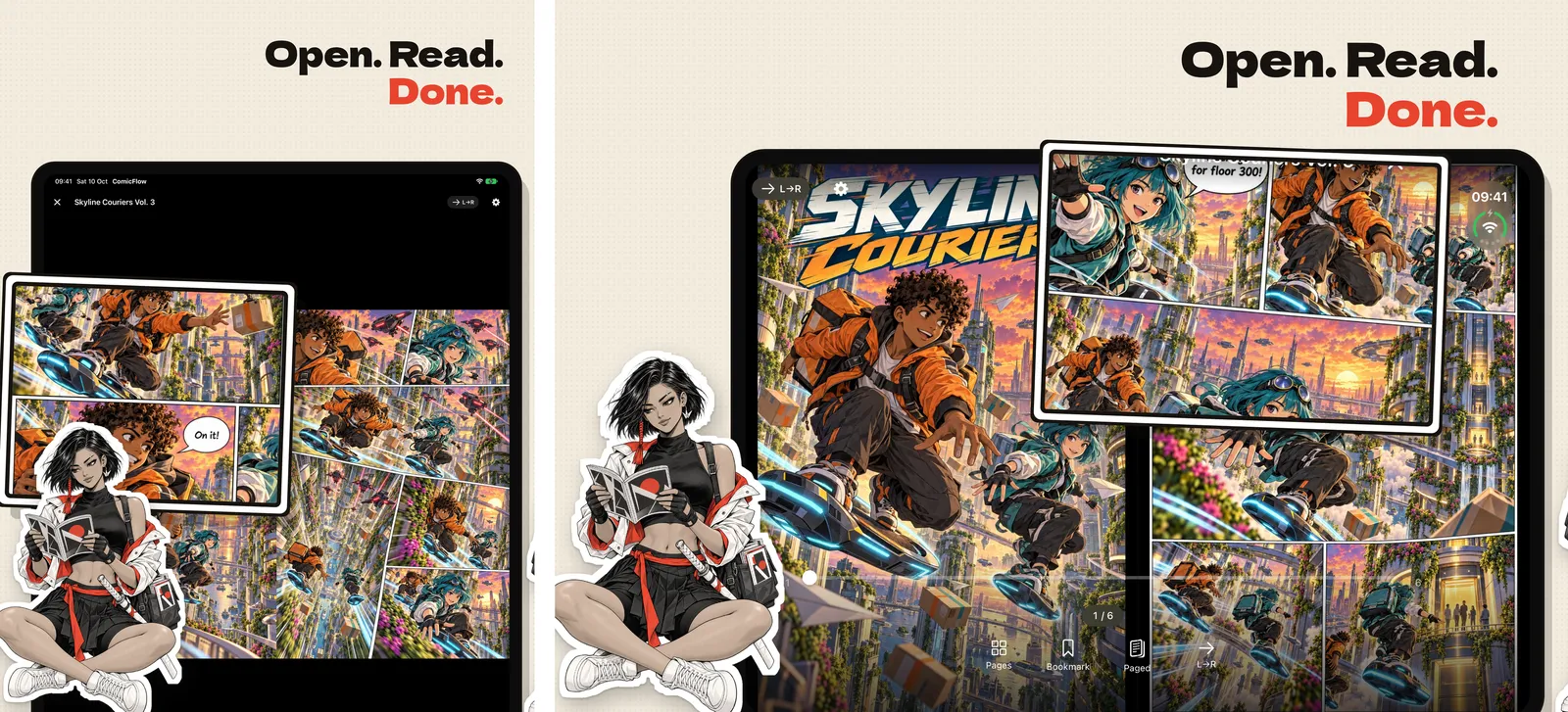
Each language gets four sets: the 6.3-inch and 6.9-inch iPhones, the 13-inch iPad and the inner screen of iPhone Duo, ten frames each. That’s 40 images per language and 720 in all.
Uploading 720 screenshots
I normally upload screenshots with fastlane. This time it couldn’t do the job: it has no screenshot type for iPhone Duo yet, and its overwrite option deletes the old screenshots before uploading the new ones. On 10 October, App Store Connect was having trouble deleting, and that combination stalled with nothing uploaded. So the set went up with the asc command-line tool instead, one device type at a time, skipping anything already there.
Then I checked all 72 sets through the API: ten screenshots in each, a checksum matching my local file in every slot, every one fully processed. I didn’t trust the website for this. During the outage it showed sets as deleted that the API still had.
What I’d tell myself before starting
- Make the character sheet first, and don’t move on until it’s right. Every pose and page leans on it. Fixing her outfit after nine poses would have meant nine more images.
- Write the obvious down. Which eyebrow, how many swords, how old she is, what she isn’t. The model doesn’t share my assumptions.
- Never let a test look for a button by its label. Not if the screenshots ship in 18 languages.
- Be upfront about what’s made up. The titles in these screenshots don’t exist, and they don’t come with the app. Your library starts with your own files, and the page says so.
Whether the new set turns more store visits into downloads, I’ll only know after a few weeks of App Store data. Either way, I wanted the store page to feel like opening a comic, and now it does.