The lines that made ComicFlow assume every iPhone was the same shape
Running ComicFlow in the iPhone Duo simulator showed stretched layouts, phone-sized covers and a reader that decided on spreads by orientation. The Duo exposed them, but several of the bugs were already shipping on iPad.
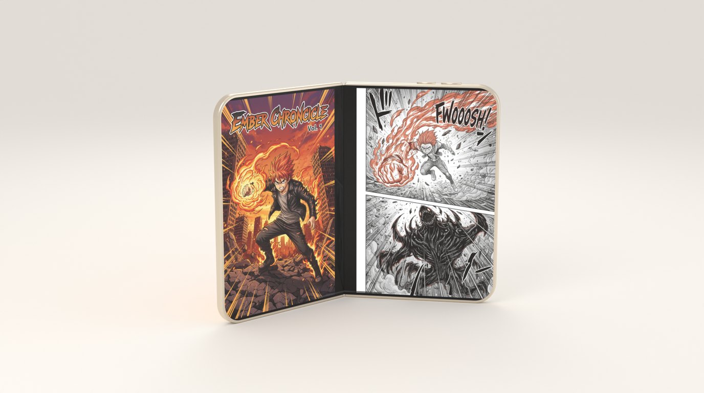
The first time I ran ComicFlow in the iPhone Duo simulator, it mostly worked. The tab bar moved to the side of the screen on its own, because the app uses a standard tab view. The What’s New sheet presented as a card instead of stretching. Nothing crashed.
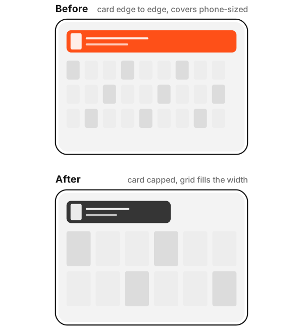
It also looked like a phone app that had been pulled wider. The empty library’s import button stretched from one edge of the inner display to the other, with everything crowded into the top of the screen. Once I loaded some comics, the Continue Reading card did the same, and the library grid kept the covers and columns I’d picked for a phone, with the extra width spent on gaps. When I went looking for why, I found the same mistake in several places, and it wasn’t a Duo mistake.
Deciding by device instead of by space
Apple’s guidance for the Duo says to stop making layout decisions from three things: the screen, the device idiom and the orientation. ComicFlow used all three.
The idiom. The Continue Reading card had a width cap, but only on iPad. In shape, it was this:
.frame(maxWidth: UIDevice.current.userInterfaceIdiom == .pad ? cardCap : .infinity)iPhone Duo reports the phone idiom, so on its inner display the card got no cap at all. The library grid had the same shape of bug in a different place. The grid picked its cover size and its column count from the idiom, so the Duo’s inner display got the phone’s covers and the phone’s columns.
The orientation. The reader’s automatic page layout showed a two-page spread when the device was in landscape and a setting was on:
case .auto: return isLandscape && settings.doublePagerInLandscapeThat reads fine until you think about windows. An iPad in portrait has plenty of room for two pages and got one. An iPad in landscape running ComicFlow in a narrow Split View window had room for one and got two. Both were shipping on iPad.
The screen. Tap zones, the page size in vertical mode, and the size hint for decoding pages all came from UIScreen.main.bounds. That’s the whole screen, not the window ComicFlow is drawn in, so tap zones and vertical page sizing were wrong in Split View and Slide Over, and pages were decoded larger than they needed to be.
Measuring instead
The fixes are mostly small.
The card now has a plain width cap with no device check. The grid counts its columns from the width it actually has. The reader shows a spread when there’s room for two readable pages, whatever the orientation, so half an iPad gets one page and a wide window gets two. The setting that tied spreads to landscape is gone, because nothing in the interface could change it anyway. Tap zones are now a fraction of the reader’s own width.
I also added a unit test that fails if UIScreen.main, the device idiom or an orientation check appears anywhere in the app’s sources. It’s a blunt rule, and it’s the one I kept breaking.
Then the fold
With the inputs fixed, the Duo-specific work turned out to be small, because the reader already knew how to show spreads.
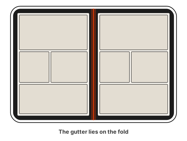
In book pose, the reader shows a two-page spread with the gutter on the crease, so no page straddles the fold. A comic is already laid out as facing pages with a gutter between them, and the fold lands exactly where the gutter should be. PDFs get an approximation: a gap the width of the fold in the middle of the pair, which lands on the crease when the fold is centred in the window.
Tabletop pose is designed but not yet seen working. The plan is the page above the fold and the reading controls in the half below it: the scrubber, the page indicator and a strip of thumbnails, with no forced spread, because the crease runs across the page rather than down the middle. The code is there. What I don’t have yet is a look at it on screen, because rotating the simulator into that pose has to be done by hand in Device Hub, and I haven’t done it yet. I’d rather not describe something as working until I’ve watched it work.
The reader finds the fold from the region the system reserves for it, not from the hinge angle. I left the hinge out entirely. A page that reflows while you adjust your grip is worse than one that stays put, and zoom now only resets when the fold appears or disappears, not every time the angle moves.
The book pose and layout work is in ComicFlow 3.5, coming around the iPhone Duo launch. It has been checked in the simulator only, since nobody has the hardware yet.
What the Duo was really testing
The three inputs looked right on every device I tested on. Every iPhone was one shape per orientation, and every iPad was bigger than every iPhone. But iPad windows could already be any size when I wrote that code, and I had never tried ComicFlow in one. A phone that can be as wide as a small tablet only made the mistake impossible to miss.
The Duo didn’t introduce new bugs so much as remove the last device that was hiding them. The iPad bugs had been there for a while. It took a phone that unfolds for me to go and look.